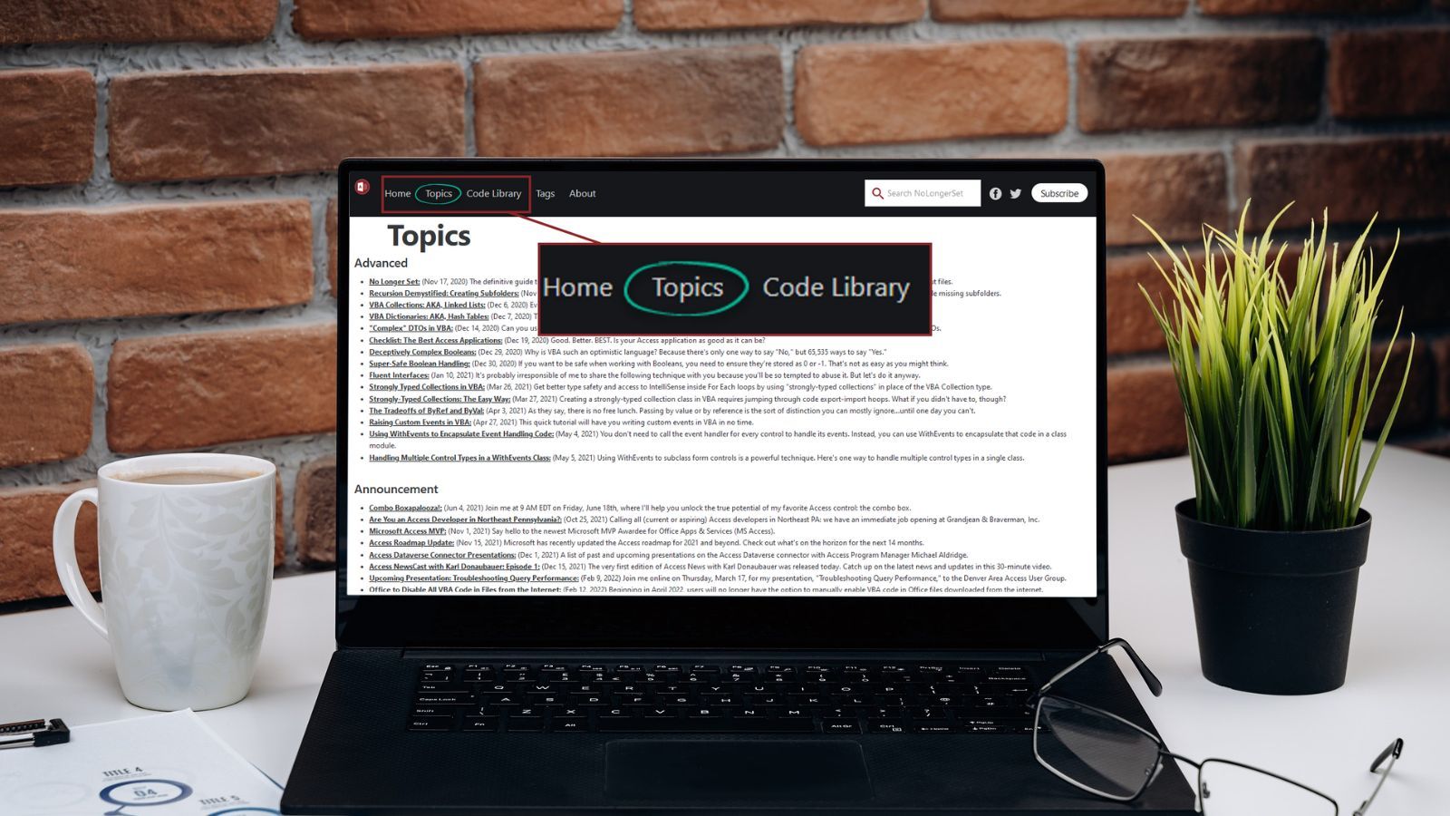
Topics Page Redesign
Check out the redesigned Topics page at nolongerset.com! It's now auto-updating and optimized for discovering new content.

I have written nearly 600 articles since I started this blog on September 1, 2020.
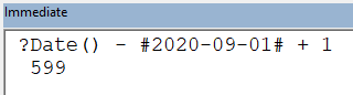
?Date() - #2020-09-01# + 1 in the VBA immediate window.When I first started out, I planned on curating a Topics page where I would lovingly arrange each article into the broader context of the overall site. Or something.
That did not last.
Instead, the old Topics page was a time machine of sorts. That's where you would go if you wanted to read one of my first 100 or so articles. Because after a few months, I stopped maintaining it. Every few weeks, I went through an elaborate process where I would try to incorporate each new article onto this hand-crafted Topics page. That was a fool's errand.
Hand-crafting is for Etsy moms, hipster micro-brewers, and M.C. Escher forgers.
Inevitably, my hand-crafted web page turned as stale as the growler of acai berry-infused IPA I politely accepted six months ago from my imaginary millenial friend whom I conjured for the sole purpose of personalizing this simile.
An Actual, Useful, Always-Current Topics Page
The redesigned Topics page has a minimalist design.
No images. No colors. Small, simple font.
Articles are arranged by their primary tag (every article on my site has at least one tag; some have several). Within each category, the articles are displayed chronologically. I sorted them like that to keep my article series (serieses?) together.
A simple [Ctrl] + [F] lets you use your browser's built-in search to find content (though I'd highly encourage you to use the dedicated SiteSearch360 search box if you're looking for something specific; it's fantastic).
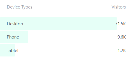
The font is intentionally small to make it easier to scroll through all of the content. That may make the page less useful for phone and tablet use, but that's a relatively small portion of my readership:
My goal with this redesign is to make it easier for readers to discover new content and explore the site.
Feedback Welcome
The early reviews are positive!
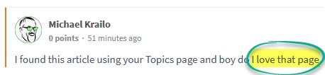
Let me know your thoughts in the comments below. How can we make the Topics page even better?
Referenced articles
 Mike Wolfe
 Mike Wolfe
Image by IVAN SVIATKOVSKYI from Pixabay