Simple vs. Easy
It's not easy to build simple software. These 4 simple tips will make the process easier.


"Simple and easy are opposites."
That's a quote from the prolifically creative Mo Willems on an episode of the Ben Folds podcast, Lightning Bugs. Willems was referring to traditional creative pursuits, such as illustrating children's books, scriptwriting, and songwriting. Designing software is every bit as creative a pursuit as those things that most people would consider "art."
Building software that is simple to use is not easy to do.
1. Less is More
So how does one go about creating simple software?
Strip away all the extra bits. Be ruthless about it. Think about what task the user is trying to accomplish with that form, with that report. If there is a field or a label that the user does not need at that moment, then remove it.
Those extra pieces of information are noise.
The parts the user actually needs? Those are signal.
My approach to software development in four words: Less noise. More signal.
2. Avoid Multi-Purpose Forms
Anything multi-purpose–by definition–does not do any one thing well.
My sister has several baking degrees: Culinary Institute of America, American Institute of Baking, and Penn State (Food Science). My wife made the mistake once of asking her what brand of all-purpose flour she should buy. My sister, apalled, said, "It doesn't really matter. All-purpose flour is acceptable for most things...but it is good for nothing. You should really buy different types of flour depending on what you are baking."
This is part of the reason why I stopped using the same form to both add and edit records.
Adding and editing are different tasks. They deserve different forms.
On an edit form, you may want to show the name of the user who created the record and the time that they created it. That's not something you need on an add form.
Oftentimes, a user needs to add several records at once. With an unbound add form, you can retain the common fields and clear the ones that change after each insert. This can be a huge timesaver for your users.
Single-purpose forms make your software simpler, but they're not as easy as letting the Access wizard build your forms for you.
3. Consider Frequency of Use
Rarely used forms require more handholding.
If a user is running a once-a-year process, there's a very good chance they forgot exactly how it works. That's especially true if it is a multi-step process. In such situations, the user will appreciate some extra lines of text printed right on the form to describe in detail what it is they need to do.
Frequently used forms should be optimized for speed of data entry.
Avoid large blocks of text. Users will quickly become blind to it anyway.
Test your form using only your keyboard. The tab order should be intuitive. Use ampersands in your labels to create Alt-hotkeys for each field.
For a deeper dive into this topic, check out my article Come Here Often?
4. Make Decisions For Your Users
Decision fatigue is a real thing.
The more decisions you have to make in a single session, the worse your decision-making becomes. Steve Jobs probably understood this phenomenon better than any other person alive in the last hundred years.
As a power user and control freak, I find Apple's approach incredibly frustrating. But I'm not their target market. Their target market is the group of people who want to press one button on a device and just have it work. No setup. No configuration. One button. Endless possibilities. In other words, almost all of the other people on Earth.
This is a trap that's all too easy for us to fall into as developers.
It's so tempting to design an application that we would want to use. But guess what? We are not normal computer-using human beings. We are all weirdos or we wouldn't be writing software in the first place.
Your users will not be changing configuration settings. By all means, put them in your software if you wish. But 1) provide sensible defaults and 2) understand that you will be the one changing those settings for your users because they won't even think to go looking for them.
The fewer decisions your users have to make, the happier they will be.
Final Thoughts
None of this is complicated.
More than anything, the key is to constantly be putting yourself in your users' shoes. (If they ask why you need their shoes, remind them that you are a weirdo.) Seriously, though, you need to be thinking about the application from a user's perspective:
- What do I (the user) know?
- When do I know it?
- What tasks do I need to complete?
- How do I complete them?
- What's the next step in the process?
- Is it obvious?
The process is really quite simple.
It's just not easy.
Referenced articles
 Mike Wolfe
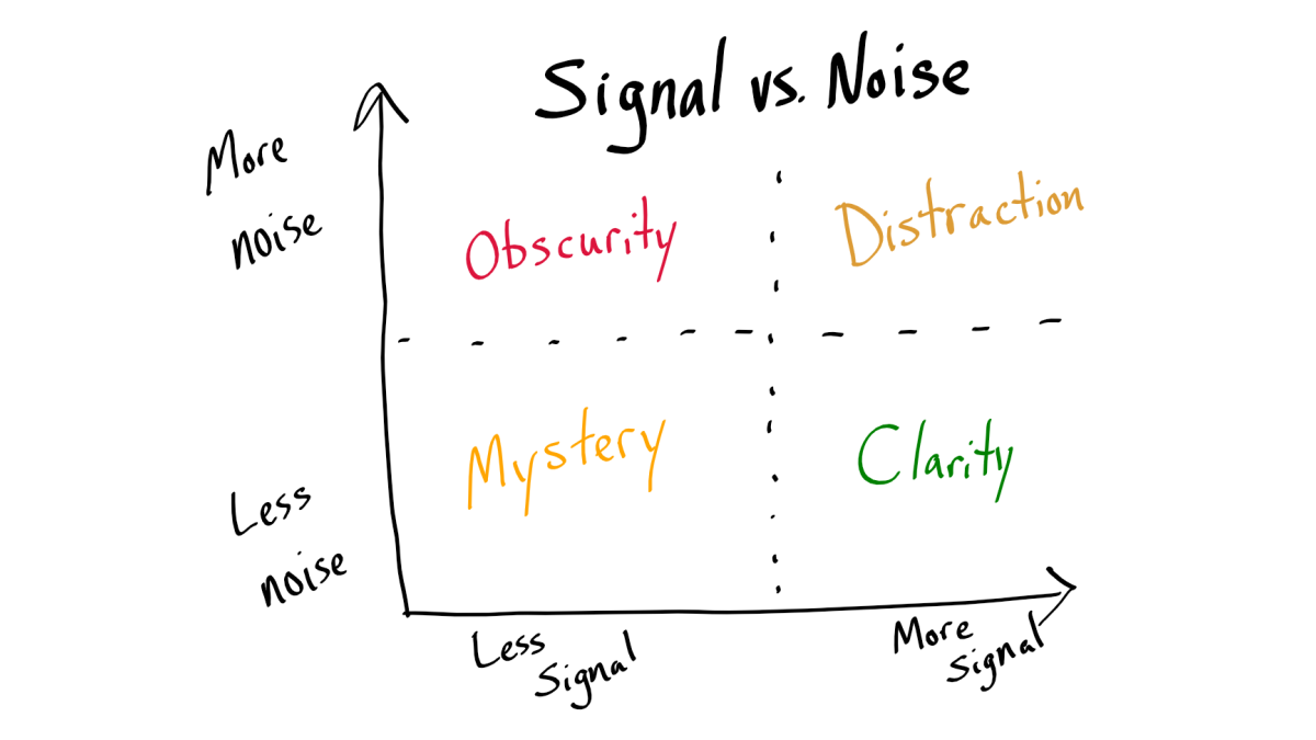 Mike Wolfe
External references
 Contributors to Wikimedia projects

 Contributors to Wikimedia projects
Image by Jaesung An from Pixabay