Accessible Design Resources from Goldman Sachs
Building accessibility into your applications improves the user experience for all users, not just those that are visually impaired.

Accessible design is a hot topic at large corporations these days.
This includes Microsoft, as the Northwind 2.0 Template Working Group can attest to. The form designs required sign-off from an entire team of accessibility testers. This was no rubber stamp process; each accessibility tester had veto power over any design if it failed to meet accessibility standards.
With the right resources, we can integrate better accessibility into our own Access applications without much additional effort.
No Shame in Freeriding
The research that goes into creating accessible design elements–color palettes, light vs. dark modes, appropriate font sizes and types–is not cheap.
However, implementing the design elements that others have already researched is no more expensive than picking arbitrary colors by personal preference. Luckily for us, there are several companies that have done the research and made the results available to the public.
Here is a brief list of resources:
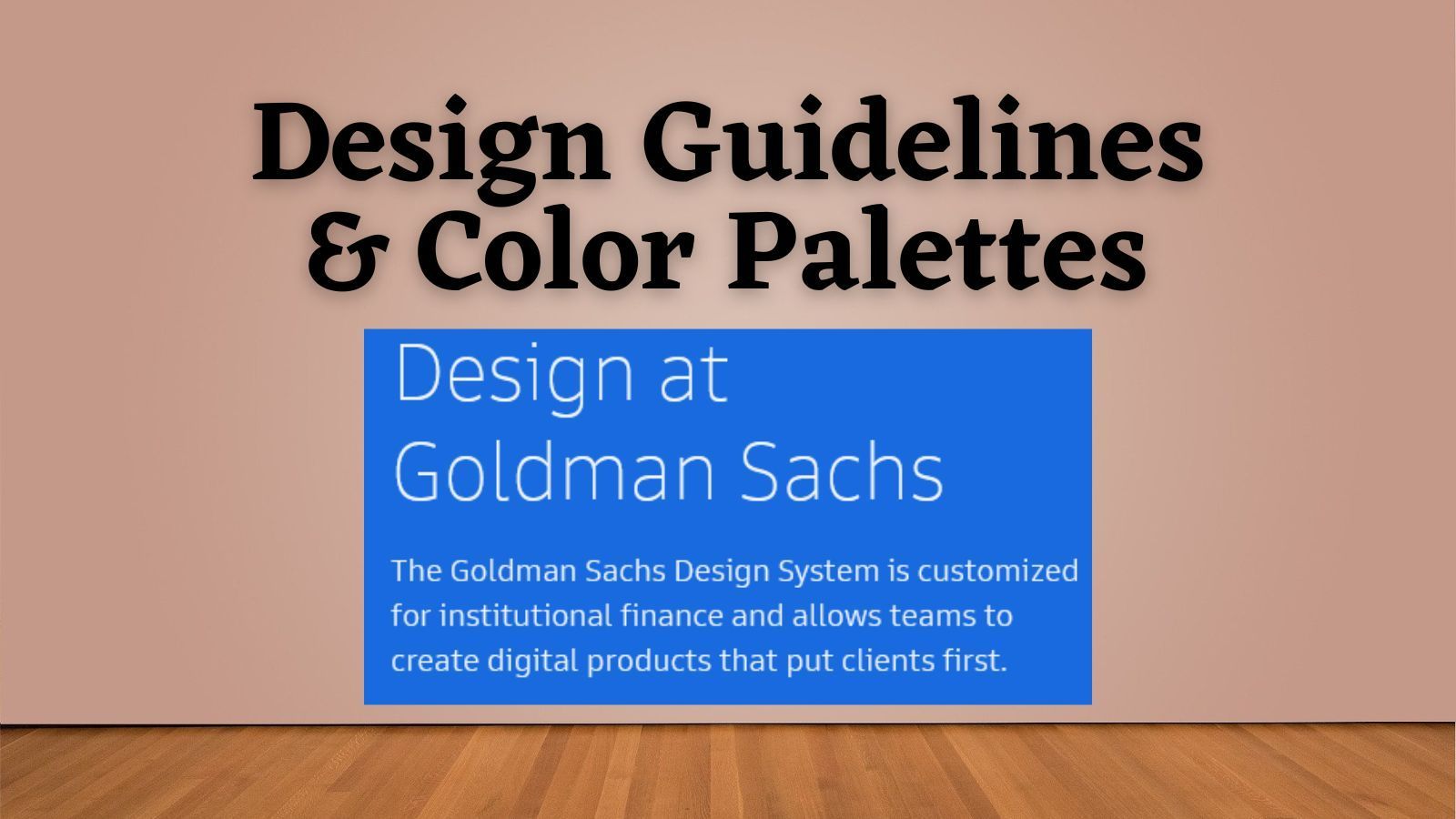
- Design at Goldman Sachs
- Carbon Design System, by IBM
- Material Design, by Google
- Inclusive palettes with Adobe Color
My advice is to peruse a few options and pick the one(s) that integrate best with your own personal style.
The Design at Goldman Sachs Website
Of the resources listed above, the Goldman Sachs website is my favorite.
Their design philosophy is a perfect match for the sort of line-of-business applications we tend to build with Microsoft Access:
- Start with users
- Clarify complexity
- Deliver value, not features
- Empower clients
- Consistency, at scale
In other words, form follows function.
There is an emphasis on clarity over "shininess." As a point of contrast, version 3 of Google's Material UI introduces "dynamic colors," which is a way of building a custom palette on the fly based on colors extracted from a user's phone wallpaper. To me, that's more gimmicky than useful.
Color Research at Goldman Sachs
The Design at GS website goes into detail on how their research team arrived at their conclusions, while also including the results themselves.
A good example of this is their research into building accessible color palettes, along with the palettes themselves broken down into various usage scenarios:
- Data visualization (e.g., charts and graphs)
- Functional colors (success vs. warning vs. error)
- Dark mode vs. Light mode
- All hues and values
Non-Color Design Concepts
In addition to colors, these websites cover other concepts related to building a cohesive user experience.
Some of these concepts apply to Microsoft Access applications...
- Keyboard navigation
- Iconography (useful for ribbon design)
- Writing guidelines (for tooltips and message boxes)
...while others are less applicable:
- Mobile design
- Responsive layouts
- Elevation (e.g., drop shadows on controls)
Conclusion
Accessibility is a crucial aspect of modern design practices.
While the research required for creating accessible design elements can be expensive, ready-to-use resources from Fortune 100 firms like Google, IBM, and Goldman Sachs make it feasible for independent developers to integrate these concepts into their own applications.
Ultimately, integrating accessibility into design not only benefits users with diverse needs but also contributes to the overall success and effectiveness of applications.
Acknowledgements
- Special thanks to Kim Young of the Northwind 2.0 Working Group whose comment on my Form Templates article introduced me to the Design at Goldman Sachs website and inspired this post.
- Initial draft of Conclusion section generated with the help of ChatGPT