Avoid Double Negatives for a Better User Experience
Double negatives are highly effective--if your goal is to introduce confusion--as my Beast Barracks story shows. They have no place in a user interface, though.

The first six weeks at West Point are known as "Beast Barracks."
It's a crash course intended to turn civilians into soldiers. One area of focus is individual responsibility. To this end, new cadets are limited to four responses:
- "Yes, sir."
- "No, sir."
- "No excuse, sir."
- "Sir, I do not understand."
The idea is to break teenagers from the reflexive habit of making excuses and deflecting responsibility for their actions. It works.
I went through this training as an 18-year-old new cadet in the summer of 1998. Two years later, I went through Beast Barracks a second time as part of the "cadre"–the group of upper-class cadets who run Cadet Basic Training. (Beast is also a leadership challenge for the upperclassmen).
Another area of focus is teaching new cadets to maintain their composure under pressure. For those new cadets who were particularly unflappable, I had a secret weapon that I would use to force them into a Catch-22: the double negative.
The basic idea was to ask a question in the form of a negative:
Cadre: Do you not respect me, new cadet?!
As a new cadet, you're completely stuck. There is no right answer (by design). The question is intentionally confusing, especially given the constraint of the four responses:
New Cadet: Yes, sir.
Cadre: Yes, you do not respect me? And why is that, new cadet?
New Cadet: No, sir.
Cadre: No, you don't respect me? And why is that, new cadet?
New Cadet: Sir, I do not understand.
Cadre: It's a simple question, new cadet.
New Cadet: No excuse, sir.
Cadre: Answer the question, new cadet! Your response makes no sense.
As you can imagine, the whole scenario is extremely frustrating for the new cadet.
Incidentally, the best way for the new cadet to handle the situation was to suppress their frustration, be respectful, and stick to the four responses.
Of course, that's easier said than done.
Double Negatives in our Applications
Now, unless you are trying to frustrate your users, you need to be careful not to present your users with these types of double negatives.
Let's say you have a long-running process and you want to give your users a way to interrupt it. Here are three options for how you might do that:
BAD: Asking user to respond to a negative question
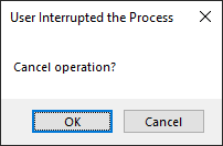
How do I confirm that I want to cancel? I feel like I'm a new cadet all over again. There is no right answer!!!!
GOOD: Asking user to confirm a positive
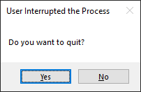
This is much clearer than the first one. At least now I know what each button will do. However, I kept the message intentionally short in the hopes that the users would actually read it before clicking on a button.
BETTER: Custom button captions describe the actions
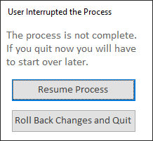
With custom button captions, we describe the action that will occur when the user clicks each button. We can freely give a longer, more descriptive message with this approach because it is less important that the user reads it in its entirety. The message merely provides additional context. The user need not read it to choose the correct button.
While I slapped together a quick custom form, you could also use Kevin Bell's modern message boxes:
 Mike Wolfe
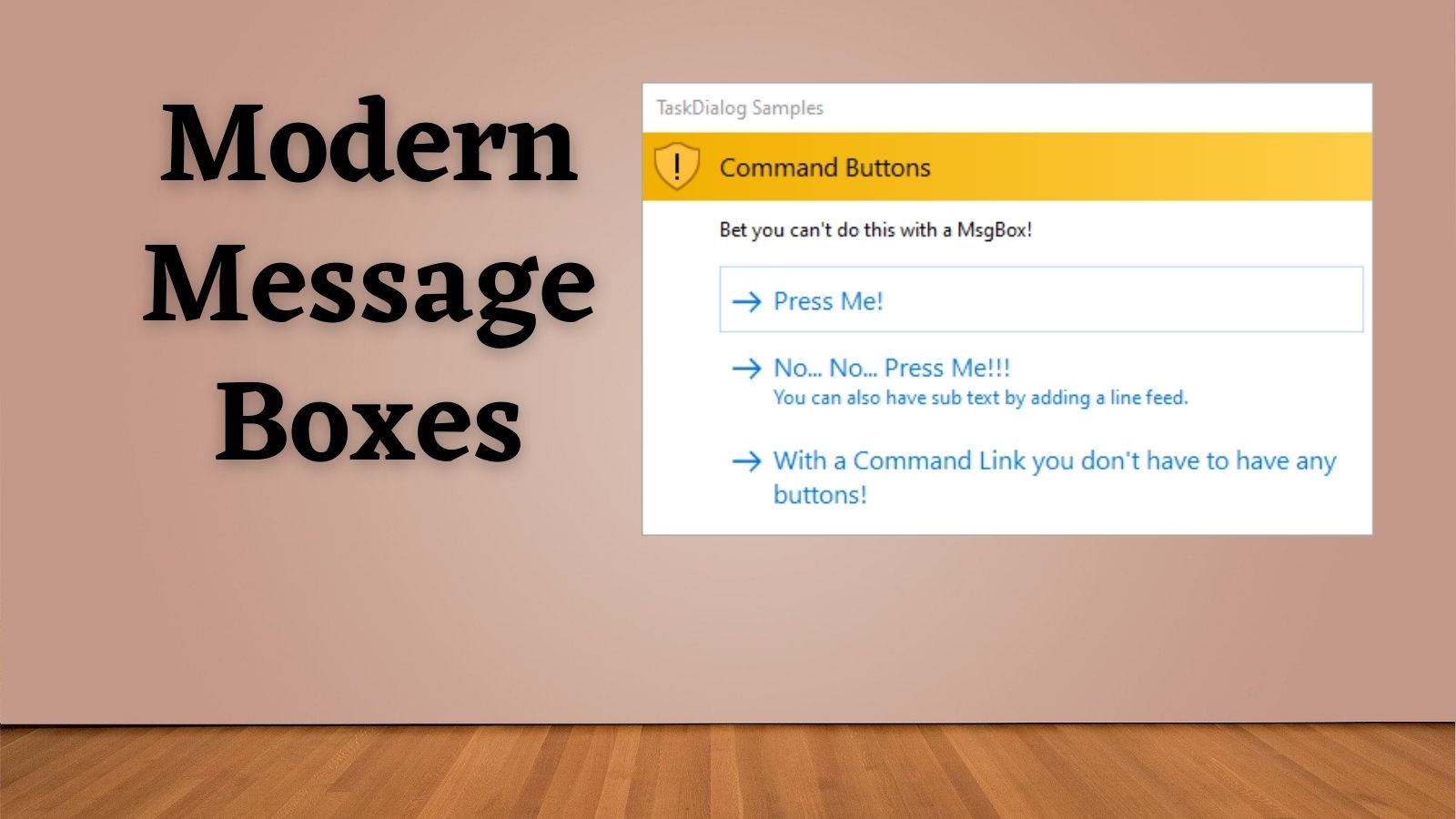
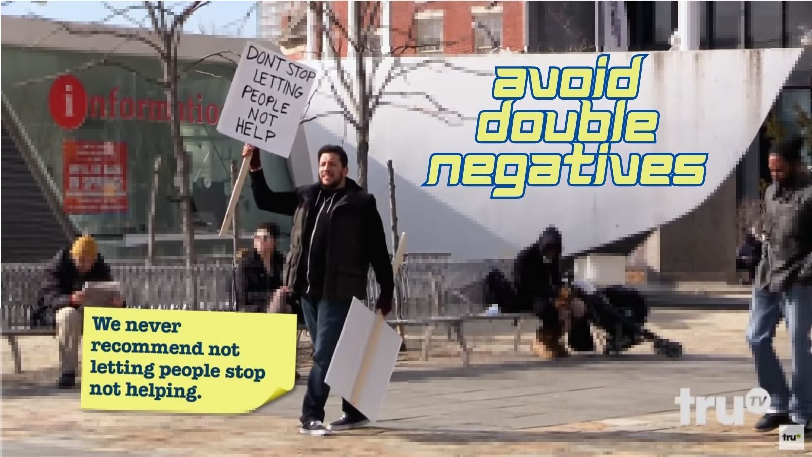
But, whatever you do, "Don't stop letting people not help." Or do. I'm honestly not sure...